CSS Multiple Backgrounds
CSS Multiple Backgrounds is a feature in Cascading Style Sheets (CSS) that allows developers to apply more than one background image or color to an HTML element. This capability enables designers to create complex visual effects and layer different backgrounds on top of each other.
Here's how you can use CSS Multiple Backgrounds:
Using CSS Properties: You can use the background-image property to specify multiple background images for an element. Separate each image with a comma. For example:
Example
.example {
     background-image:  url('image1.jpg'), url('image2.jpg');
     background-position:  right bottom, left top;
     background-repeat:  no-repeat, repeat;
     padding:  20px;
}
You can click on above box to edit the code and run again.
Output
Lorem Ipsum Dolor
Lorem ipsum dolor sit amet, consectetuer adipiscing elit, sed diam nonummy nibh euismod tincidunt ut laoreet dolore magna aliquam erat volutpat.
Ut wisi enim ad minim veniam, quis nostrud exerci tation ullamcorper suscipit lobortis nisl ut aliquip ex ea commodo consequat.
CSS Background Size
In CSS, the background-size property is used to specify the size of a background image or multiple background images applied to an HTML element. This property allows you to control how the background image is displayed in terms of its dimensions and scaling.
Example
#example2 {
  border: 1px solid black;
  background: url(img_flwr.gif);
  background-size: 100px 80px;
  background-repeat: no-repeat;
  padding: 15px;
}

#example3 {
  border: 1px solid black;
  background: url(img_flwr.gif);
  background-repeat: no-repeat;
  padding: 15px;
}
You can click on above box to edit the code and run again.Output
Lorem Ipsum Dolor
Lorem ipsum dolor sit amet, consectetuer adipiscing elit, sed diam nonummy nibh euismod tincidunt ut laoreet dolore magna aliquam erat volutpat.
Ut wisi enim ad minim veniam, quis nostrud exerci tation ullamcorper suscipit lobortis nisl ut aliquip ex ea commodo consequat.
Original size of the background-image:
Lorem Ipsum Dolor
Lorem ipsum dolor sit amet, consectetuer adipiscing elit, sed diam nonummy nibh euismod tincidunt ut laoreet dolore magna aliquam erat volutpat.
Ut wisi enim ad minim veniam, quis nostrud exerci tation ullamcorper suscipit lobortis nisl ut aliquip ex ea commodo consequat.
The two other possible values for background-size are contain and cover.
The contain keyword scales the background image to be as large as possible (but both its width and its height must fit inside the content area). As such, depending on the proportions of the background image and the background positioning area, there may be some areas of the background which are not covered by the background image.
The cover keyword scales the background image so that the content area is completely covered by the background image (both its width and height are equal to or exceed the content area). As such, some parts of the background image may not be visible in the background positioning area.
Example
.div1 {
  border: 1px solid black;
  height: 120px;
  width: 150px;
  background: url(img_flwr.gif);
  background-repeat: no-repeat;
  background-size: contain;
}

.div2 {
  border: 1px solid black;
  height: 120px;
  width: 150px;
  background: url(img_flwr.gif);
  background-repeat: no-repeat;
  background-size: cover;
}

.div3 {
  border: 1px solid black;
  height: 120px;
  width: 150px;
  background: url(img_flwr.gif);
  background-repeat: no-repeat;
}
You can click on above box to edit the code and run again.Output
background-size: contain:
Lorem ipsum dolor sit amet.
background-size: cover:
Lorem ipsum dolor sit amet.
No background-size defined:
Lorem ipsum dolor sit amet.
Original image:

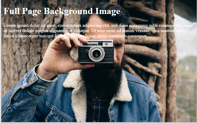
Full Size Background Image
A full-size background image, in the context of web design, refers to an image that covers the entire visible area of a webpage's background without any gaps or tiling. This effect is often used to create visually immersive web designs or to set the tone for the content on the page. Achieving a full-size background image typically involves using CSS properties like background-image, background-size, and background-attachment
Set the Background Image: Use the background-image property to specify the image you want to use as the background. This can be a local file or a URL pointing to an image hosted online.
Make the Background Image Cover the Entire Area: Use the background-size property with the value cover to ensure the background image covers the entire viewport area while maintaining its aspect ratio. This will stretch or shrink the image as necessary to cover the entire background.
Position the Background Image: Optionally, you can use the background-position property to specify where the background image should be positioned within the viewport. By default, the background image is placed at the top-left corner of the viewport.
Ensure the Background Image Doesn't Scroll: If you want the background image to remain fixed while the content of the page scrolls, you can use the background-attachment property with the value fixed.
Example
body {
    background-attachment:  fixed;
}
You can click on above box to edit the code and run again.Output
By combining these CSS properties, you can create a full-size background image that covers the entire viewport area of a webpage, providing a visually appealing backdrop for your content.