HTML Responsive Web Design
Responsive web design is about creating web pages that look good on all devices!
.jfif)
What is Responsive Web Design?
Responsive web design is an approach to web design and development that aims to make web pages render well on a variety of devices and window or screen sizes. The primary goal of responsive design is to provide an optimal viewing and interaction experience for users across different platforms, such as desktops, laptops, tablets, and mobile phones
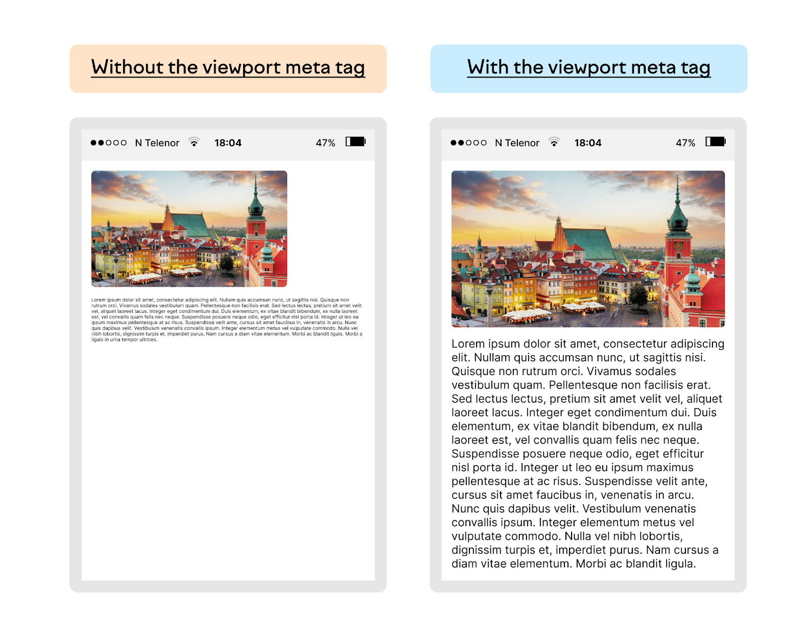
Setting The Viewport
Setting the viewport is a crucial aspect of creating a responsive web design. The viewport meta tag is used in the head section of an HTML document to control how a webpage is displayed on different devices with varying screen sizes and resolutions. The viewport meta tag looks like this:

Example
<span class="text-danger">meta name="viewport" content="width=device-width, initial-scale=1.0">
You can click on above box to edit the code and run again.Output
Let's break down the attributes used in the content attribute:
- width=device-width: This sets the width of the viewport to the width of the device. It ensures that the webpage takes up the full width of the device's screen.
- initial-scale=1.0: This sets the initial zoom level when the page is first loaded. A value of 1.0 means no zoom. It's important for ensuring that the webpage appears at an appropriate size on the device.
Including the viewport meta tag in the head of your HTML document is essential for creating a responsive layout. Here's an example of how you might include it in your HTML document:
Responsive Images
Responsive images are images on a website that are designed and implemented in a way that allows them to adapt and scale appropriately based on the characteristics of the device and screen size. The goal is to ensure that images look good and are properly displayed on devices with varying resolutions and screen dimensions, such as desktops, laptops, tablets, and smartphones.
Using the width Property
If the CSS width property is set to 100%, the image will be responsive and scale up and down:

Example
<img src="img_girl.jpg" style="width:100%;">
You can click on above box to edit the code and run again.
Output
Using the max-width Property
If the CSS width property is set to 100%, the image will be responsive and scale up and down:
Example
<img src="img_girl.jpg" style="width:100%;">
You can click on above box to edit the code and run again.Output
If the max-width property is set to 100%, the image will scale down if it has to, but never scale up to be larger than its original size:
Example
<img src="img_girl.jpg" style="max-width:100%;height:auto;">
You can click on above box to edit the code and run again.Output
Responsive Text Size
Responsive text size refers to the practice of adjusting the size of text on a website or application dynamically based on the characteristics of the viewing device. The goal is to ensure that text remains legible and visually appealing across various screen sizes and resolutions, ranging from small mobile screens to large desktop monitors.
In a responsive design, the text size is typically defined using relative units like percentages, em units, or viewport units (vw). This allows the text to scale proportionally according to the dimensions of the viewport or the parent container.
Here are some common techniques for implementing responsive text size:
Viewport Units (vw): Using the viewport width as a unit of measurement, you can set text size relative to the width of the viewport. For example, 1vw would be 1% of the viewport width.
Example
body {
font-size {: 2vw;
}
You can click on above box to edit the code and run again.Output
Em Units: The "em" unit is relative to the font-size of the nearest parent or the element itself. This can be used for relative scaling of text.
Example
body {
  font-size: 1em;
}

  h1 {
 font-size {: 2em;
}
You can click on above box to edit the code and run again.Output
Media Queries: You can use CSS media queries to apply specific styles based on the characteristics of the device, such as its screen width. This allows you to define different text sizes for different screen sizes.
Example
@media screen and (max-width: 600px) {
  body {
      font-size {: 14px;
  }
}

@media screen and (min-width: 601px) and (max-width: 1024px) {
  body {
      font-size {: 16px;
  }
}
You can click on above box to edit the code and run again.Output
By employing these techniques, designers and developers can create a more user-friendly and visually consistent experience across a wide range of devices. Responsive text size is an integral part of responsive web design, contributing to a better overall user experience.